Introduction
At PRIOn, we actively gather GitHub Proof of Concept (POC) Exploits associated with CVEs (Common Vulnerability Exposure) to enrich our understanding of vulnerabilities and make formal prioritization decisions on those data. GitHub is one of the many sources that PRIOn decision engine utilizes.
It is evident that with the proliferation of open-source platforms like GitHub, cyber security researchers, practitioners and hackers alike have leveraged this platform to share, discover, and analyze vulnerabilities, thereby shaping the cybersecurity exploitation disclosure.
In this blog we delve into a time series analysis by trying to answer questions such as:
What patterns characterize the trend of GitHub Exploits over time?
Are there recurring seasonal patterns evident in the dataset of GitHub Exploits?
Which weeks exhibit the highest levels of GitHub Exploit activity?
What are the peak periods of GitHub Exploit activity throughout the week?
Which week of the year demonstrates the highest levels of GitHub Exploit engagement?
Furthermore, as a last mile we make a prediction for the year 2024. By analyzing the vast repository of POC exploits hosted on GitHub, we aim to uncover underlying patterns, discern emerging threats, and forecast the trajectory of cybersecurity vulnerabilities for the next year.
Data
During the analysis we collected and analysed the “created_at” timestamp which represents the date and time when the repository was initially created or initialized. It is a fixed timestamp indicating when the repository was first set up on the version control platform.
Period of analysis (Years): 2018-2023
Number of exploit repositories for this period: 11068
By reshaping the dataset into months the summary statistics for numerical columns such as count, mean, standard deviation, minimum, maximum, and quartiles as they follow:
Number of months: 72
Mean: 153.72
Std: 91.0
Min: 37
Max: 513
25%: 80.5
50%: 136
75%: 204
IQR: 123.5
Observations
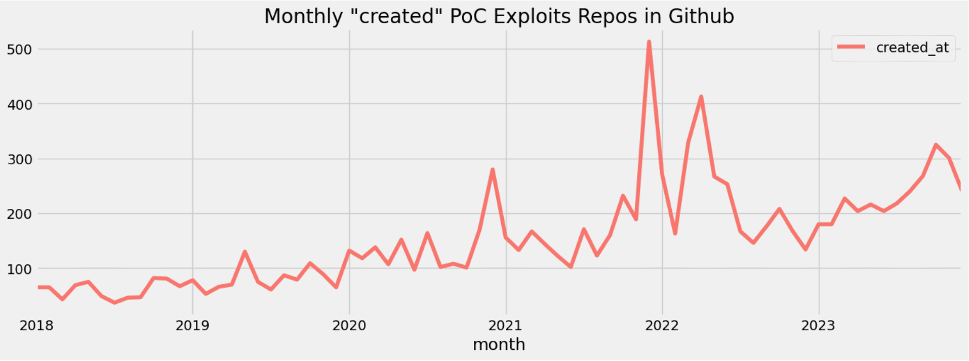
In the following image we depict the number of “created_at” PoC exploit repositories by month during the last (6) six years. We can observe four main peaks. The first one happened at the end of the year 2020 (280), the second one at the end of 2021 (513), the third one at the end of the first quarter (329) and at the beginning of the second quarter (413) of the year 2022. Finally, the forth one happened last year at the beginning of the fourth quarter (325).
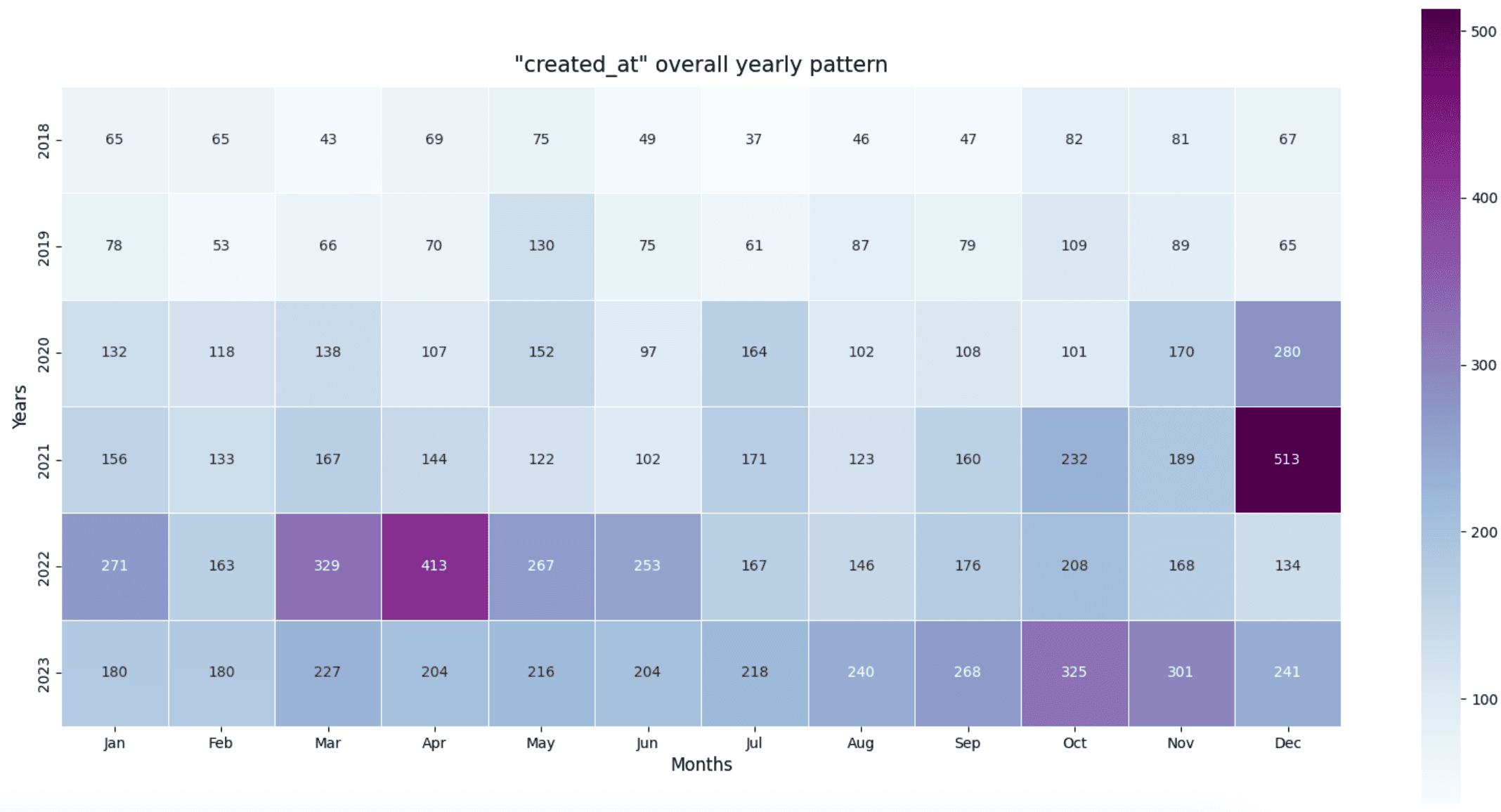
The heatmap image below provides clearer insights into the numbers.
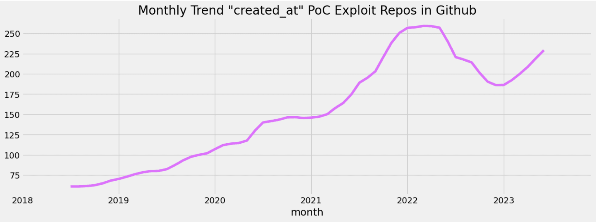
In the image below, we showcase the trend of repository creations over the past six years. It's clear that repositories containing proof-of-concept exploits exhibit an upward trajectory.
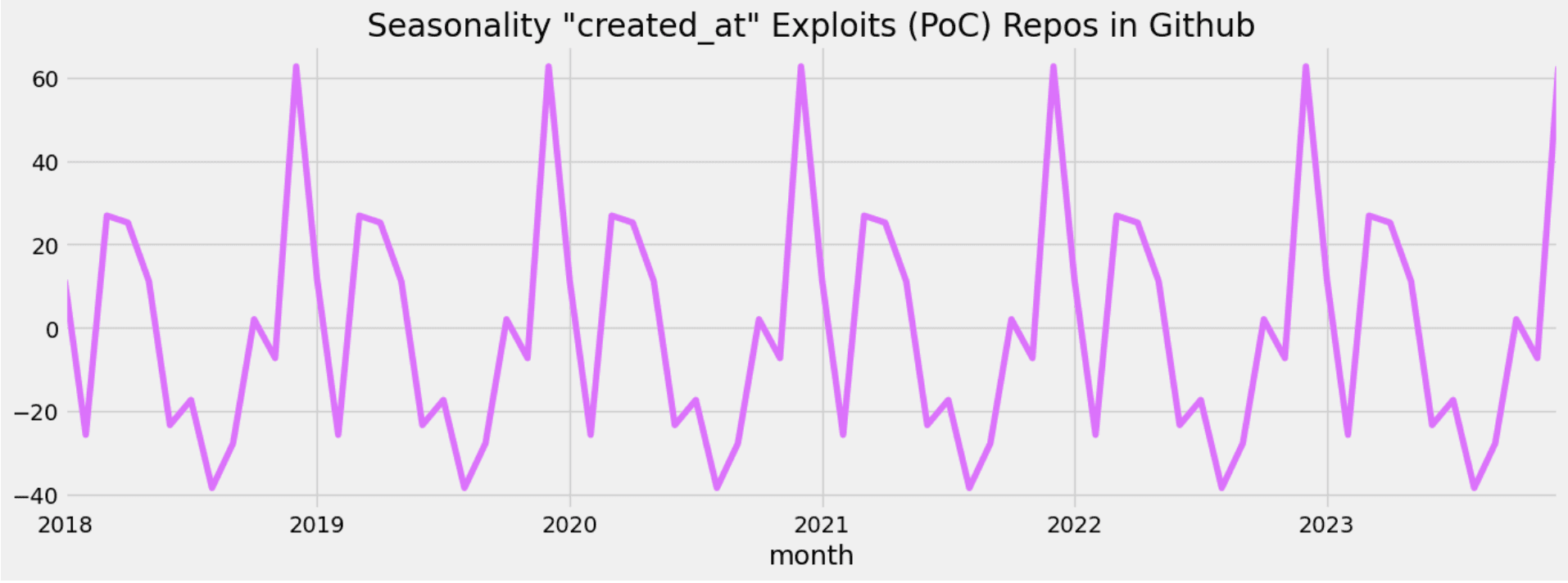
In the image below, we illustrate the seasonality of repository creations over the past six years. It's apparent that repositories containing proof-of-concept exploits exhibit a distinct seasonal trend. We notice at least two peaks: one between the end of the first quarter and the beginning of the second quarter, and the other, the largest peak, occurring in the fourth quarter. Additionally, there is a noticeable dip during the third quarter.
In the image below we depict a view of the daily calendar “Created_at” Exploit PoC Repositories.
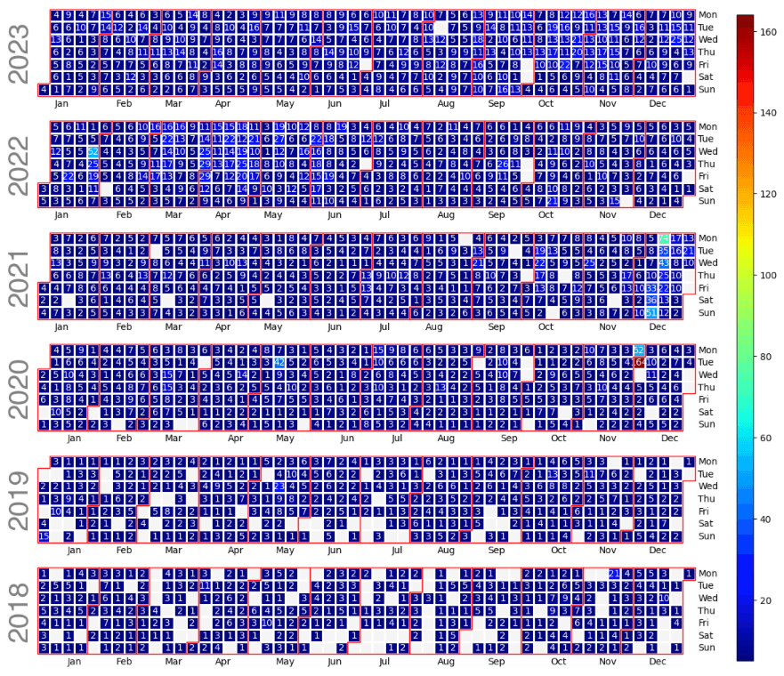
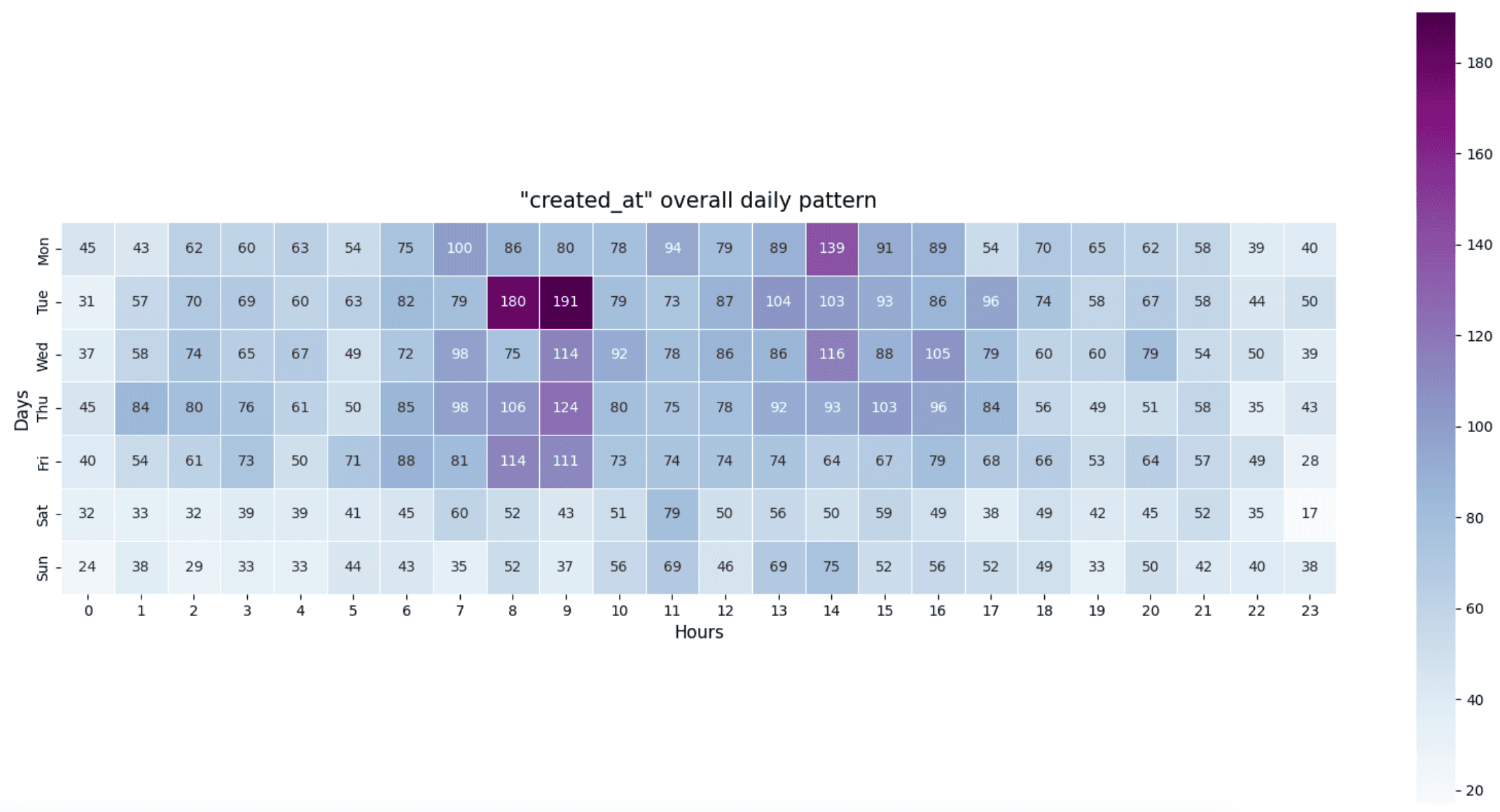
In the following heatmap, we depict the daily activity pattern, revealing that early mornings, late mornings, and afternoons experience the highest levels of activity. Notably, the majority of repository creation occurs during traditional "business" hours, with weekends appearing comparatively quieter. This observation may come as a surprise, suggesting that cybersecurity professionals/practitioners, students, hackers, you name it, like anyone else, likely take time off on weekends to socialize, relax, or pursue other interests. The busiest periods are observed between 08:00 and 09:00 in the morning, followed by 14:00 in the afternoon, with Tuesday emerging as the busiest day overall.
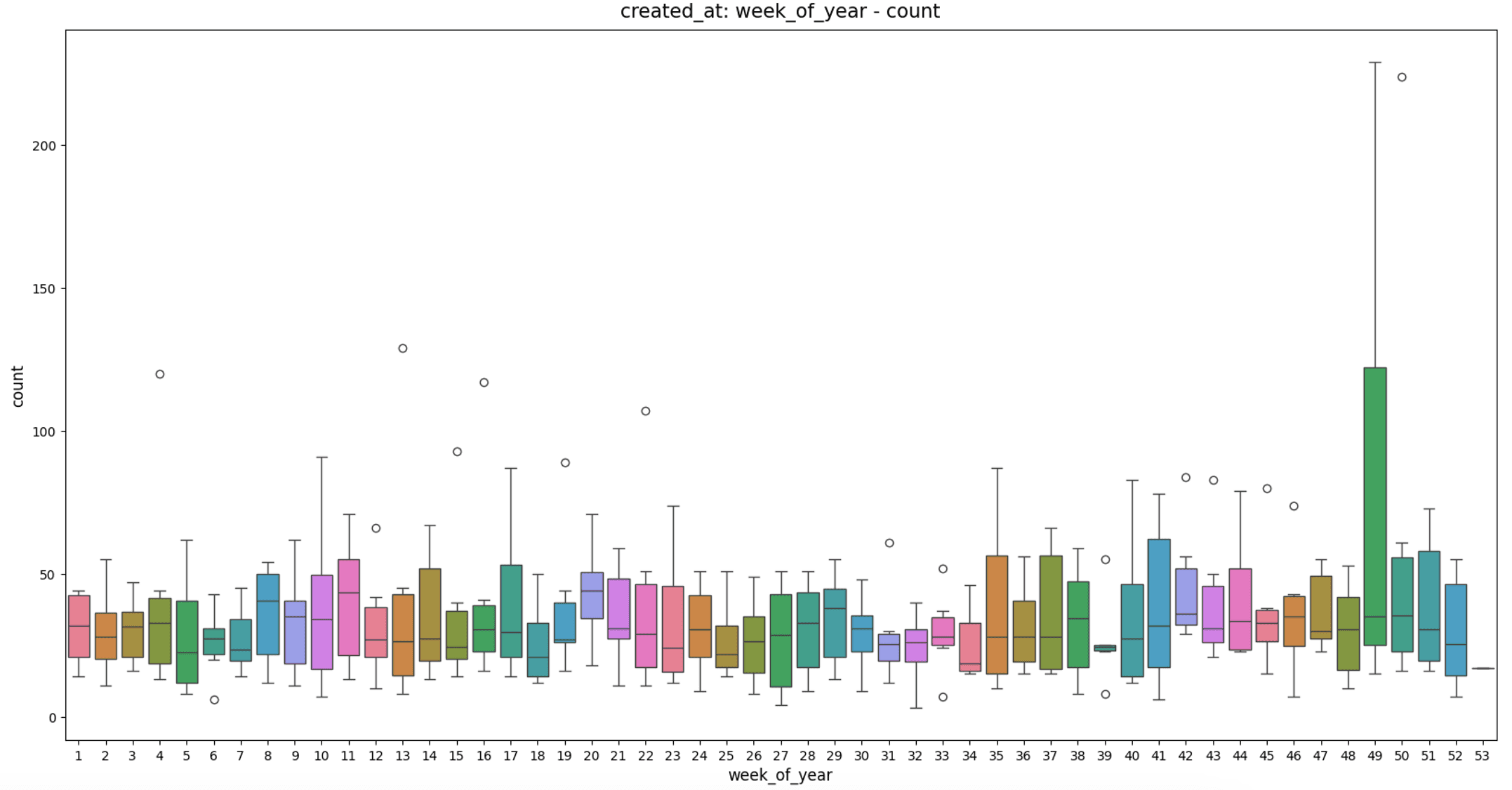
In the image provided, we can discern the most active week of the year. It's evident that week number "49" stands out as the busiest. Week 49 corresponds to the period from December 4th to December 10th.
Prediction
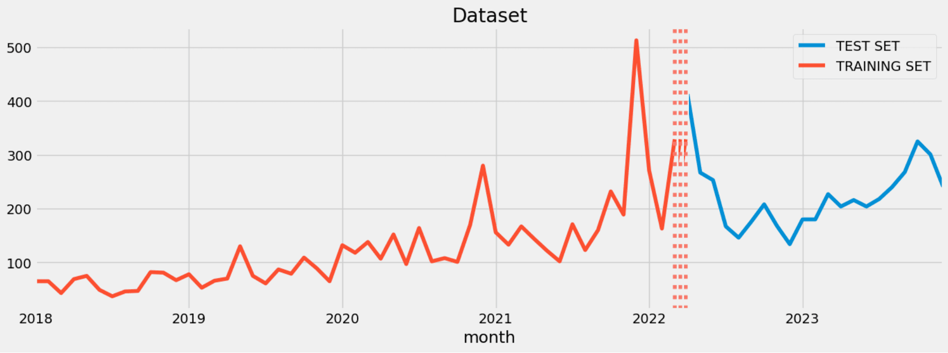
As a final step, we conducted a prediction for the year 2024 using time series analysis techniques. By reshaping the dataset into monthly intervals, as discussed earlier in this blog, we divided it into training and test sets. The following image illustrates the training and test sets.
For the forecasting we used the SARIMAX model. The SARIMAX (Seasonal AutoRegressive Integrated Moving Average with eXogenous factors) model is an extension of the ARIMA (AutoRegressive Integrated Moving Average) model, which is widely used for time series forecasting. We optimized the hyperparameters to minimize the error in our model as much as possible.
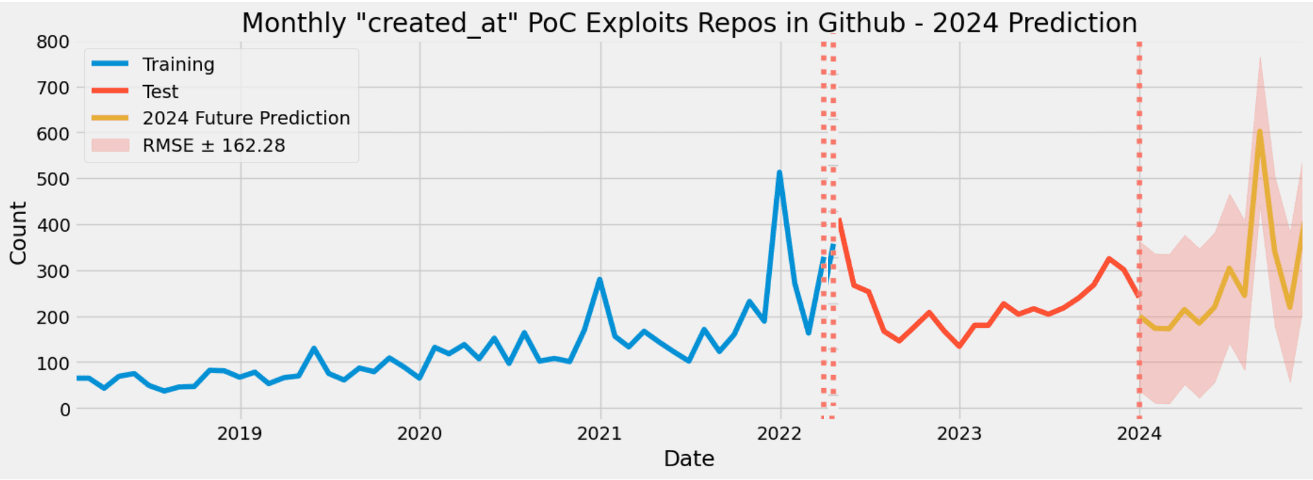
The model's Root Mean Squared Error (RMSE) was calculated to be ±162 units, indicating that the model's predictions deviate from the true values by approximately ±162 units on average. This metric serves as a measure of the model's accuracy, with lower RMSE values indicating better predictive performance. To ensure comprehensive analysis, the number of exploited Proof of Concept (PoC) repositories created in January 2024 was observed to be “312”, falling within the range predicted by the model.
Conclusion
In this comprehensive analysis, we delved into the realm of time series analytics focusing on the 'created_at' timestamps of exploit Proof of Concept (PoC) repositories. We examined trends, seasonal variations, and discerned numerous insightful patterns embedded within the data. Leveraging our findings, we ventured into forecasting future trends, particularly for the year 2024, shedding light on the anticipated behavior of 'created_at' timestamps. Notably, our analysis revealed a recurring pattern of trend and seasonality that is expected to persist into the future. It is anticipated that cybersecurity professionals, practitioners, researchers, students, and even hackers will continue their active engagement in disclosing CVE exploits (PoC) on platforms like GitHub. The amalgamation of such insights, coupled with additional contextual third party information, will undoubtedly enhance the effectiveness of vulnerability prioritization efforts.
How PRIOn can help
PRIOn is an AI driven vulnerability prioritization technology. PRIOn is here to automatically prioritize vulnerabilities, public or private, that matter most across your entire environment. Contact us here for any inquiry/demo. We are here to assist you to transform your vulnerability management lifecycle.